
The city of Sugar Land, Texas, has always believed in innovation and trailblazing. As a growing city in the Houston region with around 115,000 residents, we manage a large and complex portfolio of capital projects across water, wastewater, drainage, mobility, parks, and public facilities. With limited staff and increasing demand, we needed a better way to see how we track staff project workload and allocate resources not only transparently but also efficiently and effectively.
Instead of turning to expensive platforms or outside consultants, our engineering team built a simple but powerful tool in-house. This resource allocation and workload dashboard connects directly to our GIS database for capital projects, allowing us to assign projects and forecast staff capacity for five years into the future. Because the GIS system was already in place and licensed, creating the centralized database came at no additional cost. The database now serves as the centralized source of all project-related information, from project status and funding to construction photos.
Project managers update their projects through a single portal, and those updates feed directly into the centralized database. From there, the data is displayed in different views for leadership, staff, stakeholders, and residents, eliminating duplicate work and making updates easier to manage. Residents can see nearby projects, timelines, progress photos, and future plans, while staff and leadership have the detailed views they need for planning and oversight. The result is greater efficiency and stronger public trust built through transparent and data-driven decisions.
Why Was the Old System Not Enough?
Our previous approach relied on PDF books and spreadsheets. It worked, but it did not help us plan ahead or adjust quickly when priorities shifted. We couldn’t easily answer questions like:
• Is the project assignment fair for each engineer or project manager?
• Do the engineers and project managers manage their project effectively?
• Will we have enough staff for upcoming years due to projected increase in capital improvement plan (CIP) projects?
• When will we hit capacity?
• Do we need to fill vacancies and when is the best time to do so?
• Will it overload anyone?
We needed a better way to see the full picture and make decisions before problems arose. At the time, we still found the answers, but mostly through conversations, quarterly meetings, and one-on-one check-ins with supervisors. Those methods do work, and we still use them today. The difference is that we have made the process more agile, efficient, and data driven. The goal was not to replace our system. It was to give it a new brain.
How Does the Resource Allocation and Workload Forecast Tool Work?
Each capital project in Sugar Land is tracked in our GIS database. That system stores the location, type, budget, timeline, and other relevant project information. To help plan workloads, we assign each project a score based on its complexity and stage of delivery. The scores range from 0.1 for a simple project to 3.0 for a highly complex one. Those project workload scores are linked to the assigned project manager and inspector based on their experience, skillset, and nature of the job. This allows the dashboard to calculate each staff member’s total workload and identify when capacity is reached.
The dashboard puts all of these elements together in one easy-to-use visual platform. It shows who is doing what, when, and for how long. It highlights when someone is over capacity and when there is capacity to take on more. The dashboard updates daily, so forecasts are always current. It shows patterns, like when too many projects start at the same time. This helps us even out the workload and keep delivery on track.
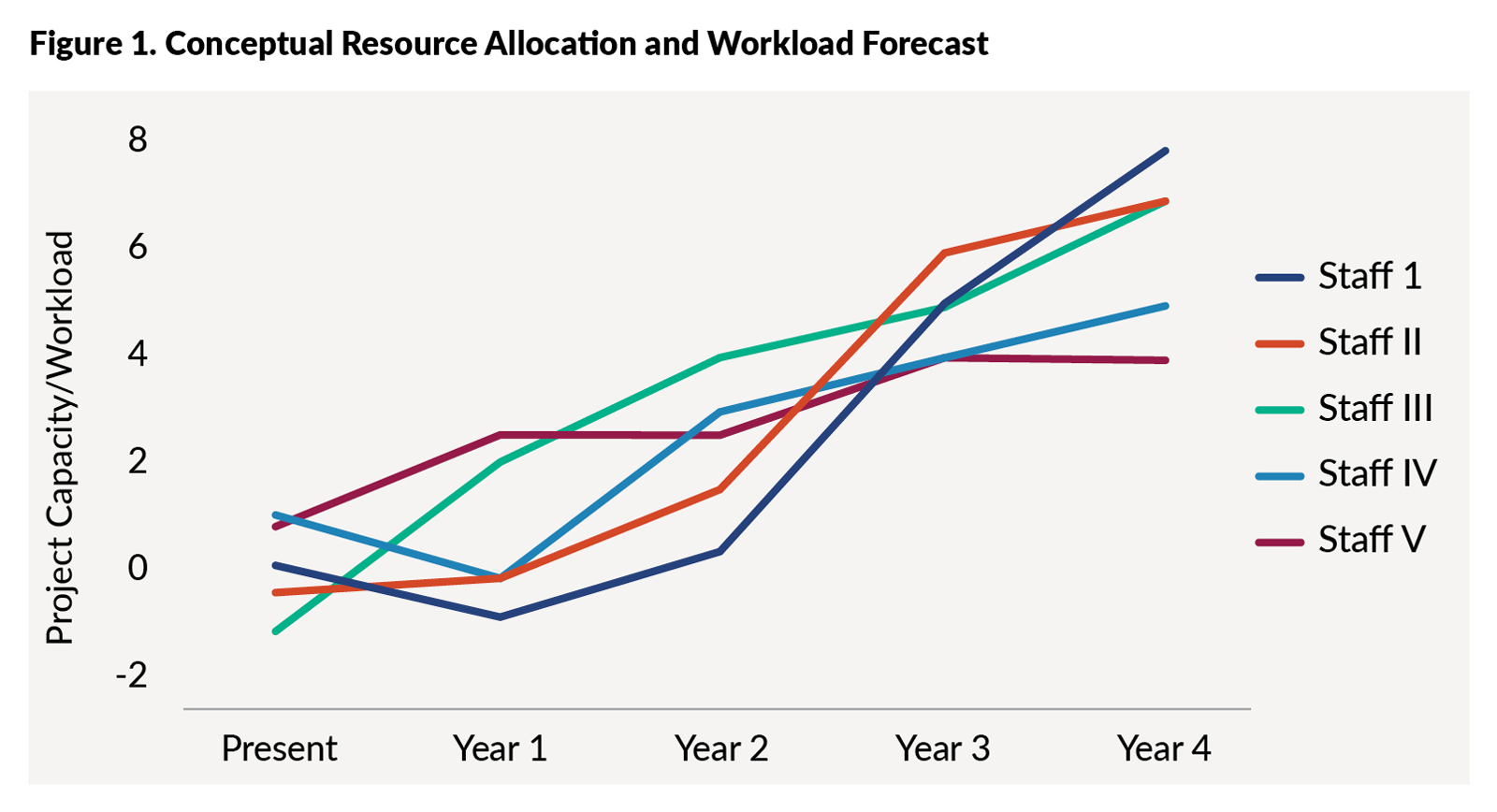
The figure below shows a conceptual forecast from our workload dashboard. The lines represent a staff member’s projected workload over the next five years. The view makes it clear when staff will exceed capacity and when there is capacity to take on more projects. By spotting the trends early, leadership can plan project delivery, balance assignments, prevent burnout, and make data-driven staffing recommendations.
Before, when a small project (such as a storm inlet replacement) came up mid-year, we scanned spreadsheets, checked skills and timelines, and checked with project managers to see if they could take it. It took time and some back-and-forth. But now, the tool shows real-time capacity by person, including work that is already assigned but not yet started. The city engineer and assistant city engineers can see who has capacity for more projects and when. We can assign the project in minutes now. The system emails the selected project manager with the scope, schedule, links, and contacts so they can start right away.
Planning for the Future
When the city prepared for the $350 million general obligation bond election in 2024, we utilized the tool to analyze our team’s capacity so that we could clearly communicate to the public if additional staff would be needed or not. The results indicated that we will be able to manage the additional workload without hiring additional staff. The dashboard helped us develop a plan to ensure staff could deliver those additional projects without delay. It also allowed us to time the start of projects in a way that avoided burnout or bottlenecks.
Instead of guessing, we could point to data. That helped build trust with leadership and backed up our staffing recommendations with facts. The dashboard gave us a common language for communicating about workload.
What Did this Transformation Change for the City?
• Project managers save about four hours a month on updates. Across the team, the savings add up to hundreds of hours each year.
• The resident story map received more than 1,000 views in the first year.
• Ninety-five percent of projects now post monthly updates on time.
• Leadership uses the forecast to sequence starts and avoid overlapping.
• There is no duplicate entry for project managers. One update feeds every view.
Timeline of the Rollout
The idea and early design began in spring 2023. We defined the data schema and scoring scale in the same period. A small pilot ran in summer 2023 with a few project managers. The current version of the dashboard was ready in spring 2024 and the department adopted it in March 2024. We tuned the scoring rules that summer and added filters and summary cards based on feedback. By late 2024, the practice was part of our regular budget and staffing conversations.
Transparency for Residents
The same GIS information used to manage internal work is shared with the public. Our CIP story map lets residents see where projects are happening, what stage they’re in, what’s next, and how to report issues or concerns. Updates come directly from project managers. This makes residents feel informed. It also builds accountability. If something slips, it’s visible.
Trust comes from showing your work, and we have seen that when people understand the process, they are more likely to support funding for future improvements.
Built by Staff for Staff
We didn’t hire a firm to build the dashboard. We did it ourselves using tools we already had and people who knew the work. This saved money and made change management easy since the team initiated the change. It also helped staff build new skills.
Since launching the dashboard for capital projects, other departments have asked for similar tools. A small initiative that started as a project tracker has become a shift toward improving efficiency and better data-driven decision making across the city.
What Other Cities Can Learn
Our experience shows that local governments don’t need a big budget or a big team to make real impact. If your data is centralized and your staff is willing to try new ideas, you can build tools that make the work easier and more efficient.
Cities can start small by mapping their projects and giving each project a simple workload score. Then leverage existing tools like Excel or Power BI or GIS to build an analytical dashboard that conveys the story. The last step would then be to publish multiple views that provide necessary information to the staff, stakeholders, leadership, and residents. The win isn’t the software. The win is keeping data current, accurate, and using it to make decisions.
The city of Sugar Land isn’t a tech company. We’re a city. We built this because we care about working smarter and serving our residents better. The change came from inside our organization. As our city manager says, “We want make our residents’ life better than they can imagine.”
Lessons Learned
• Start simple: A small, clean schema beats a perfect one you never finish.
• One portal: Enter data once, publish many views.
• Lock the scoring rules early, then tweak quarterly.
• Protect privacy. Use roles internally, use generic labels in public.
• Make the update cadence sacred. Monthly works.
• Celebrate small wins. A saved hour here and there builds momentum.
Conclusion
Sugar Land’s workload tracker isn’t just another dashboard. It’s something we use every day to have better conversations and make smarter decisions. It helped us spot issues before they became problems. It helped staff pace their workload instead of burning out. And most of all, it helped us earn trust from our team, leadership, and the residents. That’s the kind of quiet innovation local governments are capable of when we build tools that actually reflect how we work.

ALENCE POUDEL is a senior engineering manager for Sugar Land, Texas.
Acknowledgment: The success of this work comes from the team effort of the Sugar Land engineering department. Special thanks to executive director/city engineer Jessie Li, PhD, PE; assistant city engineers Jonathan Braun PE, CFM and Robert Wilson, PE, CFM; and our team members Melanie Beaman, Carla Barrios, EIT; Huy Ton, PE; and Paola De La Torre. Their input helped turn a vision into working tools that are now used every day.
Publish with ICMA!
We’re searching for interesting and insightful stories that can help others learn a memorable takeaway to serve their communities better.
